Empowering educators and course designers to create end-to-end intentionally designed learning journeys.
In early 2021, Argos was born out of an open-source collaboration between groups in two very different universities to re-imagine the textbook for the digital age and return power to educators.
“In 2022, we partnered with Argos Education to help create Sojurner, their new open-source e-learning experience.”
Outcomes
90 Days complete high fidelity Prototype handoff
71%User satisfaction rating
Key Insights
01. Balancing inspiration with conversion
02. Hierarchy as we see it
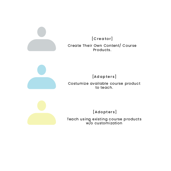
03. One cohesive experience, 3 distinct groups of users
“You’ve taken a very complex multi-step process and made it feel very simple and inviting”
Anita Delahay-Chief Research Officer” -Argos Education
“How can we make sure that we have a uniform experience going through these different products that we're now trying to build into one thing, how to make it feel less like a Frankenstein”
Ed Beck-Instructional Designer at SUNY Oneonta
Challange
While the use of digital courseware recently soared—more than half of universities now use these tools today, e-learning tools are often hampered by inflexible designs and steep user learning curves, which render the tools less valuable for instructors.
Argos Education aims to remedy these issues by democratizing content and allowing educators and course designers access to Sojourner. Their business module, free for educators, designers, and other creators to adopt and craft courses, provides a new marketplace allowing educators and institutions to sell, purchase, and adapt previously designed courses, lesson modules, and other tools.
Role & Responsibilities
Market &User research
Stakeholders' workshops
Wireframes and Prototyping
Unified visual design
Sojourner main user's personas
Scope& Strategy
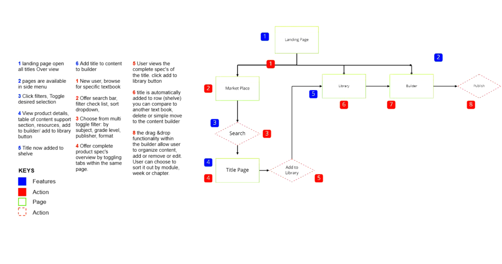
Three design teams were tasked to create the experience for Sojourner's three distinct use cases, (Creators, Adaptors, Adopters) The strategy was to diverge & converge toward the final step of creating the high-fidelity product with the other two teams.
Once we validated Argos target user hypothesis, the goal then was to design an intuitive, efficient way for educators (adapters)to search and browse a course catalog, and help them identify areas to customize and create new content. The client segmented
Adapting is a process that is not limited to one specific target persona.
Designing with Context In mind.
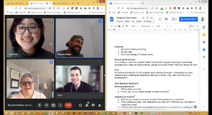
At the project's outset, we lacked clear goals for our user persona experience without pre-existing insights.
We looked to both users and stakeholders during the workshops to help us better understand our target persona as we had no clear shared understanding of who an Adaptor was."
I unpacked pages of the recorded interview scripts with our SMEs to be able to capture the relationship between the user and adapting experience.
By understanding our user mental module, we worked backward by clearly defining the outcomes to determine the core features and the information to display to our users while bypassing the onboarding process and focusing more on creating an intuitive straightforward user flow.
01. Balancing inspiration with conversion.
We selected 4 main touchpoints to focus on.
Help user find supplemental text for the new course
Help the user make informed decisions.
Provide intuitive customization tool
Let user come back and iterate course
“Something that I learned in my career, is that people ask for a lot of things, but we have to find a way to change what we are already doing to work with new things”
Elizabeth Mahler-Associate Teaching Professor and Faculty Lead, Learning Experience Design &Technology Program
02. Hierarchy as we see it.
The goal was to reduce the number of clicks relevant to the task by creating a in one user interface and having all features easily scanned and interacted with at first glance.
62.5 SUS MVP Score at the first time.
We ran our first usability testing with the SME’s we interviewed since it was clearer now that their instructional design expertise is critical to assess and test the product.
We used Metrics such as user errors rate, time spent on task and overall task success rate during the MVP testing. Though the score wasn't as bad there was still a lot to improve.
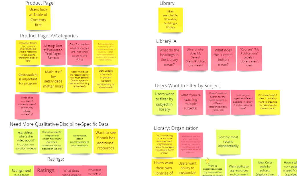
For an example users needed to see more in-depth details about the product, table of content, and resources included, title comparison and other user reviews.
03.A unifying design
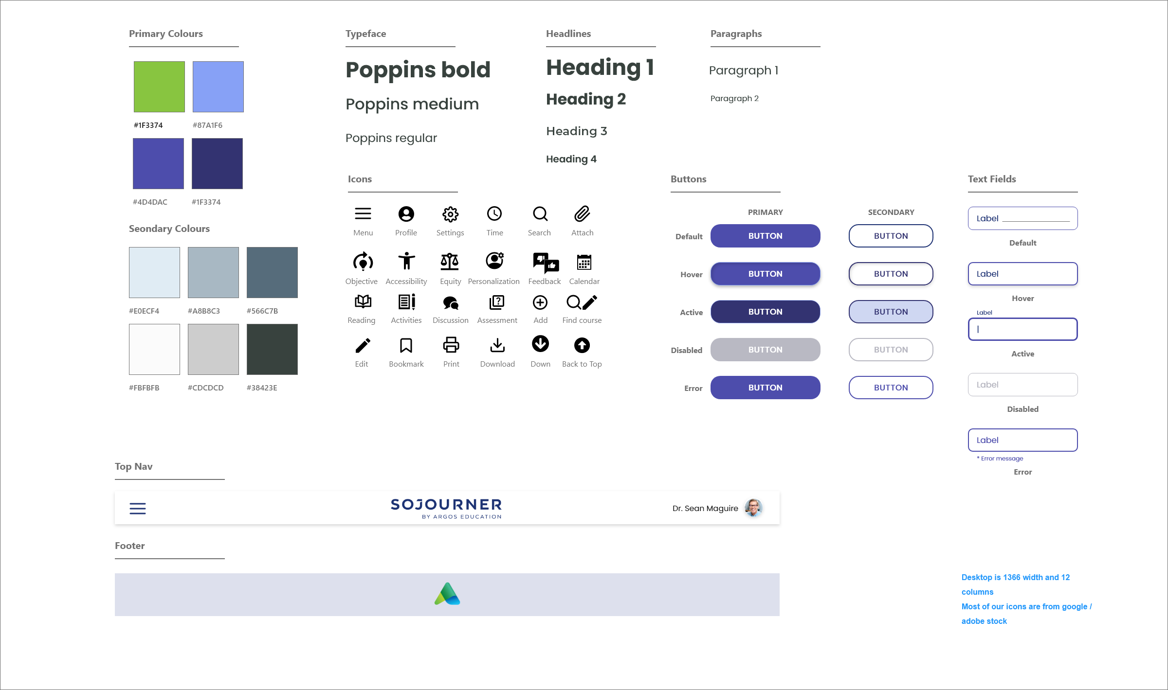
I worked with the two visual designers from the other teams to create the design system and give it the final unified look with accessibility standards in mind.
We also did one more workshop with the client to make sure we are keeping the design look and feel of Sojourner consistent with Argos visual identity.
Product Hand Off
The product features and design received positive feedback from both stakeholders and SMEs and its currently in development.
The final design scored 71% on the SUS (System Usability Scale) when tested with K12 teachers.
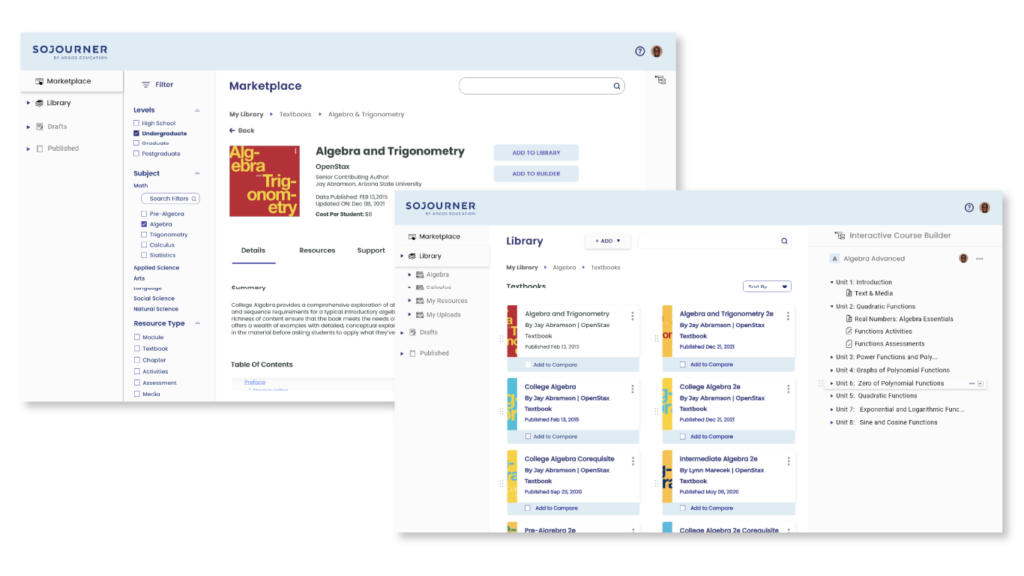
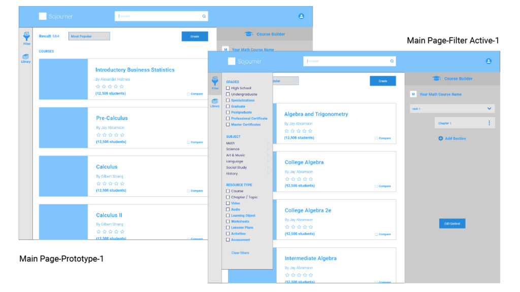
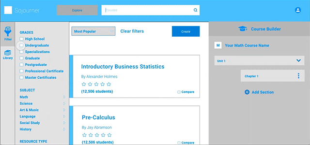
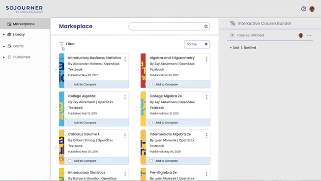
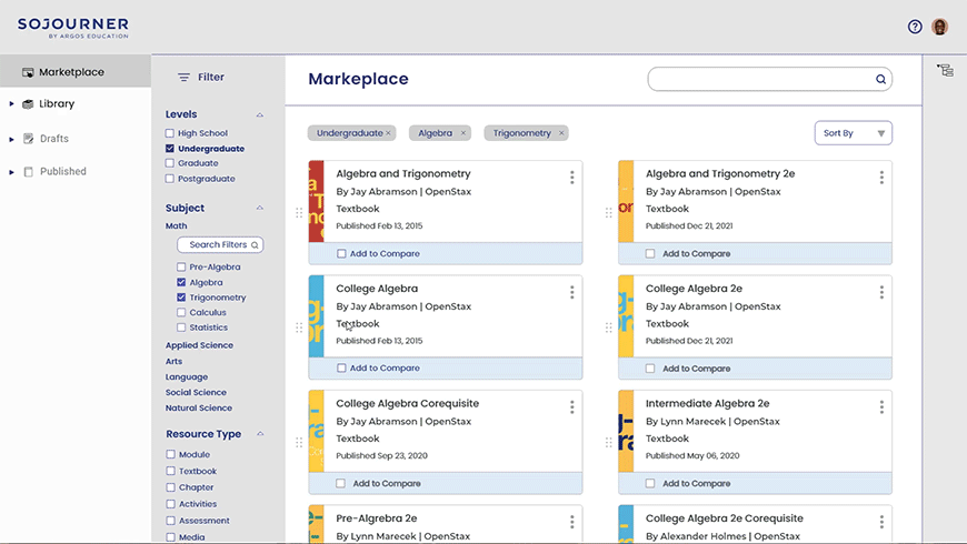
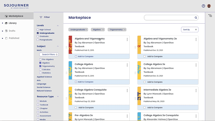
Intuitive Search Filter
Selecting Supplemental Resources
We organized filters into a hierarchy to support the most-used content and make it easier for users to find relevant resources.
Select & Compare
Comprehensive Comparison
Users want to compare 2 resources in detail
Does it have an assessment? Resources? this will allow user to make an informed decision before committing to selection.
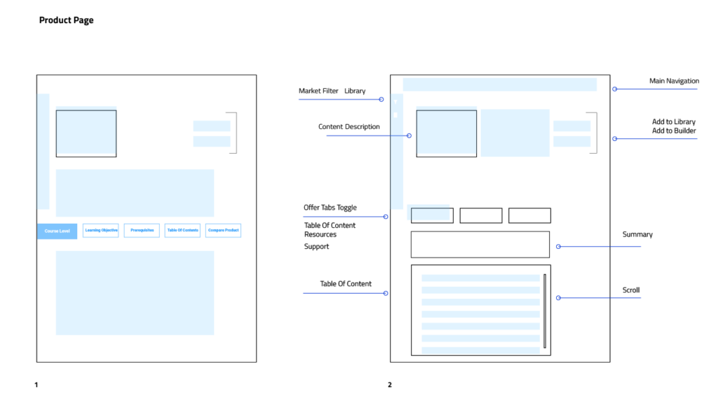
Product Details & Resources
Product Overview
A product page with a simple sub menu allows user to find all the important information they need to know, by toggling between lists, they can explore all the necessary information they need without jumping to a different page.
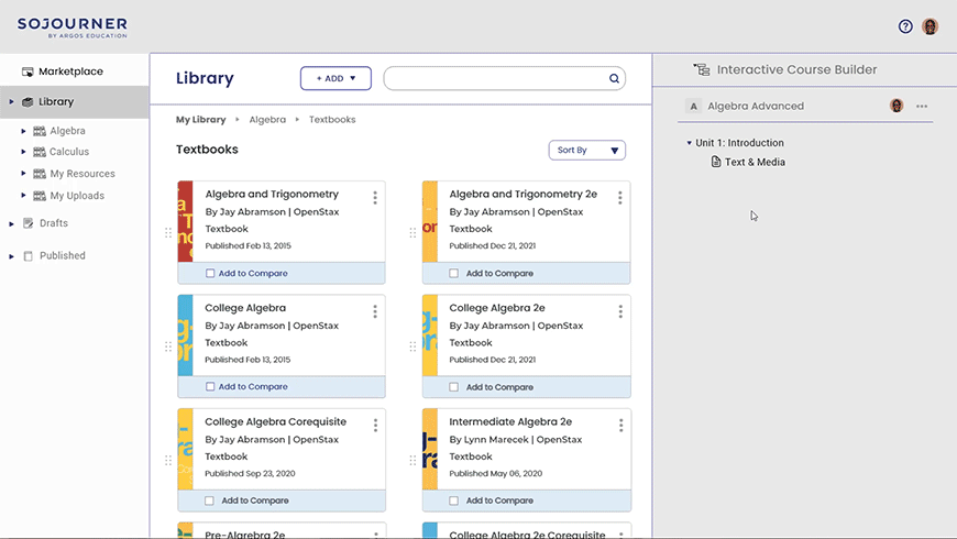
Course Builder
Create& easily iterate
Drag and drop course builder with a simple clear hierarchy will help the user with all heavy lifting when creating the course. Each block has its own set of features allowing them to be customized independently, you can save and publish but also go back and iterate anytime you want.
What I Learned
I came to this project with a visual designer mindset, but as we moved further into the project, I began to think more about the context in which you can explore solutions when facing what seems to be a complex question. By documenting our user's interviews we were able to eliminate any preconceived notions and biases that can restrain us from looking at the problem from a new angle.